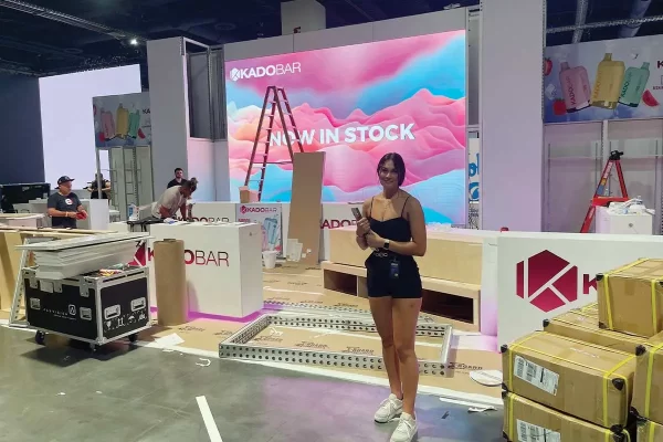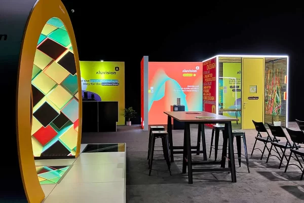
As a designer, there are those moments on the show floor or flipping through a magazine, when you are faced with a design so dynamic and inspiring that you cannot help but stop and stare in admiration. This article is not about those moments. This is about those other moments, when you are left staring at a design while scrunching your face and leaning your head to one side, while asking, “What were they thinking?”
Defining the problem
What makes a design bad? That isn’t so easy to define. An emotional reaction does not fit on a spreadsheet, you just feel it in your gut. For the sake of this discussion, let’s boil it down to a few simple categories.
• Message/branding: Does it clearly define the client logo and brand message?
• Aesthetics: Is the space cool? Do you want to explore and learn more?
• Functionality: Big or small? Is the space organized and easy to navigate?
• Client Satisfaction: This is paramount. Did it do what the client asked?
Reasonably, you can justify some designs because this is what the client wanted and ultimately that is where the rubber meets the road; however, those designs rarely fail in all areas.
I am referring to the projects void of any branding impact, are an aesthetic and graphic joke, and, to top it off, are a functional nightmare to work in.
Designs rarely fail in branding, aesthetics and functionality, and still retain client satisfaction. These are the solutions that should never have seen the light of day.
Let the creativity begin
When a new exhibit design project kicks off, we expect to see photos of the old exhibit as part of the initial download process. This insight gives the opportunity to better understand the client’s objectives and why the client is investing in a new exhibit.
It is not uncommon to see a design that was developed for a smaller space or a smaller budget that has been spread into bigger space. Other examples are casualties of a brand identity overhaul, dated design cues or an old marketing theme that influenced the architecture, branding and material choices made.
While these designs can be eye sores, they are not the worst. The real head-scratchers are the designs that still smell new, with no presence, charisma, message or interest. You can see it in the way people react to the space.
The blame game
When the results are less than admirable, who is to blame? The client, the exhibit house or the designer? Reasonably, you could say all of the above, but I think that responsibility falls squarely on the exhibit house and the designer, simply because they should know better. Better solutions should have been presented and better recommendations given.
Outside of the human element, the budget is by far, one of the biggest contributors to ugly, right? Not necessarily. The fact is that ugly does not discriminate size or budget.
Personally, some of the most beautiful and thoughtful solutions I’ve ever seen have been low-budget small spaces. Creativity can happen on any budget at any size.
How did we get here?
Whether the design was created “by committee” or simplified due to a last minute budget cut, we have all experienced the moment when the design process takes a turn for the worst.
If the final design was a result of client misdirection or because of the concept the client choose, possibly the lesser of two evils, their dissatisfaction was likely solidified when confronted on the show floor with a similar design, identical in every way, except not ugly.
In that moment, they realized they could have had a more impressive, striking, crowd-gathering, image-reinforcing space, for the same money. Call it “creative buyer’s remorse.”
Within reason, it should not cost any more to build a good design as a bad design, because it comes down to size, proportion, materials and scale. Sometimes, it is as simple as the material choices and graphics, which cost no more to apply or to produce.
Where do we go from here?
The upside to the shortcomings of your competitors is the opportunities they create every day.
When the reasons for an upgrade are painfully obvious and overdue, we have a tremendous opportunity to be the hero and save the day.
Ultimately, our client’s desire to improve their past design has brought them to us. As we think of all the ways we can help, we need to remember our responsibility to our client, their budget and their objectives.
We owe it to them, and we owe it to ourselves to explore and create design our clients are inspired by, not settling for.
The bottom line
We would all like to keep our clients happy and retain them for years to come. To do so, we must provide the creative solutions that exceed their objectives. If we don’t, we consider the risk of providing our competitors with a future slam-dunk opportunity.
If that doesn’t motivate you, consider the idea of them reviewing your design and asking, “What were they thinking?”
Ultimately, it is far easier to critique than to be creative, and that door swings both ways. But in a creative profession, those are the challenges we face every day.
Armed with a healthy dose of peer pressure to motivate us, our design solutions should be a little more thoughtful in the eyes of our biggest critics of all: Ourselves.
David Linderman is design partner and co-owner of Core Design Group, based in the West suburbs of Chicago. As an independent freelance design firm in business for almost 10 years, Core Design provides its clients with a reliable and confidential design source specializing in trade show exhibit, corporate environment, and retail design. You can visit them online at www.coredesigngroup.net or contact Dave directly at dlinderman@coredesigngroup.net.
| Home |
| People on the Move |
| National News |
| International News |
| Opinions |
| Tradeshow Calendar |


